Back in FPA 319W: Critical Writing in the Arts, I put together this proposal for an exhibition up at SFU Burnaby for the Spring 2017. The original idea was to do it as part of a directed study or undergraduate fellowship. Neither of those happened and instead In Circulation happened. Seeing as I’m still up here on the hill over the summer, I’ve been revisiting the root concept. Basically, after all these years, it would be nice to do a project that somehow engages with the campus, a kind of farewell project in a way.
Right now, the idea I’m throwing around is to shoot a photographic series of self portraits around the Burnaby campus. Photographed alone in the empty school, I’m hoping to reference an endless sense of being here after everyone else has left (or of always being here early (as if)). Meanwhile by positioning myself in the centre of spaces, on railings, ledges, and in other unexpected places I’m hoping to temporarily claim the university and make a subtle plea to be noticed (while also suggesting that same sense of ‘waiting’). I want to take advantage of the school’s scale and architectural features to make the composition dramatic and interesting, and for now I have a test/reference photo from a few years ago.
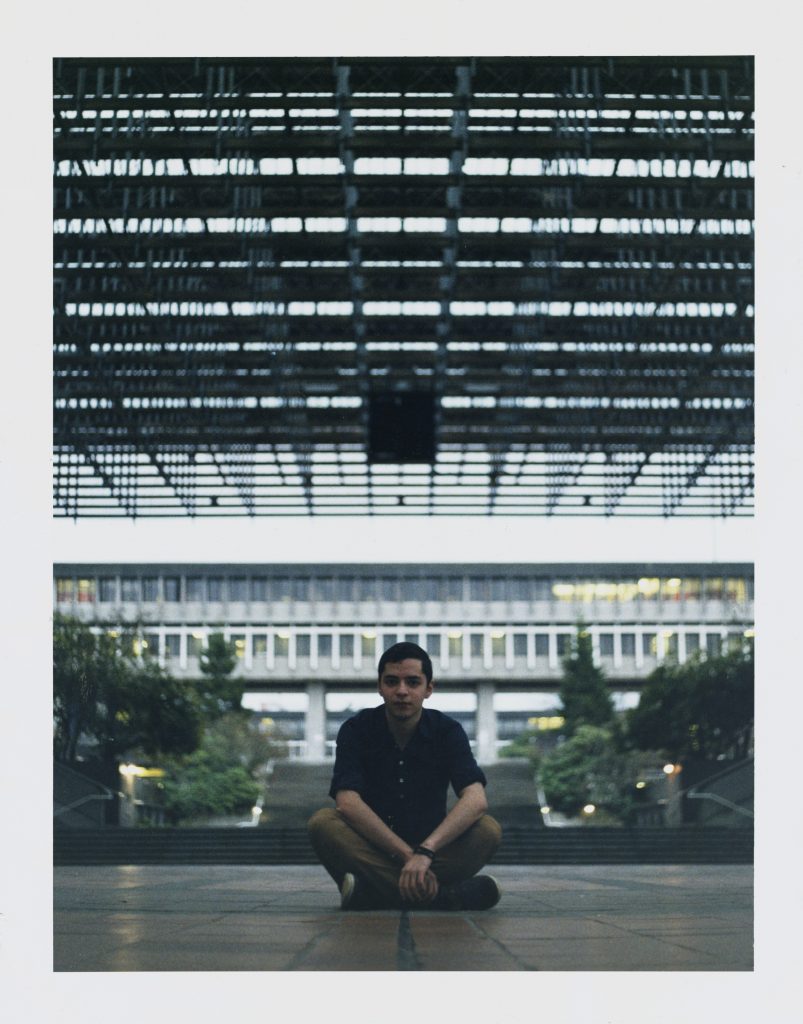
Self Portrait (Convo Mall), Oscar Alfonso, 2015
This series would consist of several photographs and I don’t currently have an exhibition plan (as right now I’m just thinking about how I’d shoot them). I feel that if the idea is to make a kind of last documentation/farewell gesture, that they then have to physical exist in the space. The question then becomes one of how, and where, and one of timing. If I’m done in august, is it then? Or is it in October when my contract runs out and I’m also Convocating (and actually leaving)?
As for how, there are a lot of options depending on what aspect of the relationship I want to focus on. They could be signs, prints, posters, a book, postcards. This I don’t know yet. However, if the idea is that they document my presence before I leave (the whole farewell, notice me bit), then perhaps it’s worth thinking about how to make these photographs public/published. This precludes traditional prints which are simply ‘exhibitied,’ but rather proposes a format that can be packaged, shared, and disseminated.
This is of course, a very personal project. It comes after eight years of calling this place home, and is a way of trying to rationalize the inevitable ‘letting go,’ and ‘moving on’ that comes with that. Referring back to the earlier thought of waiting and belonging here, I wonder if there’s some way of suggesting baggage (emotional and literal) or a kind of staying behind in the space through the use of accompanying objects. Another alternative in the other direction is to frame the photographs as self portraits and then not be in them, in the process suggesting an absence in the space (not easy). Alternatively, It could become a broader series with other equally lost human beings. A series of portraits around long lasting, tense/tenuous relationships with the university.
So this is where I’ll let this journal end. It’ll be a complicated project, and it needs a lot more ideation and discussion. It would be my first post-grad/inter-grad project closing off my degrees, and it would fit within my broader interests in belonging, storytelling, the university, and architectural space. If they’re also physically around the school somehow, then that’ll also be some work to figure out. So, here’s to my next project!
]]>
Act I
Act II
Act III
Act IV
Act V
Act VI
Cassidy Rossander – Oceanside Reads: Fill your shelves – oceansidereads.com
Cassidy has set up a book review site for Young Adult Fiction, framing her site to showcase books with relatable characters in her age group. This focus is an interesting one (I don’t know when’s the last time I read about someone in my age group to be honest).
There’s two odd quirky things in her ‘about’ section. The first being that it’s a category composed of posts. I don’t know if she’s thinking of expanding it with additional ‘about me’ content in the future, but I think it could function as a more permanent page. In one of her process posts she’s noted that most visits hover on the homepage. I agree with her that it works since her homepage is a blog feed that keeps the most recent content at the top. Given that however, I’m thinking it might be useful to make a little snippet of the ‘about’ section available on the front page, perhaps in the right sidebar somewhere. That way, her specific age-group focus is always available, even if you don’t make it into interior pages. The second strange thing is the most recent post in the ‘about’ section, which is ‘A video from me to you.’ It is set as a downloadable ~70 mb file so it’s not the most accessible form. I didn’t realize it was just going to start downloading when I clicked on it. Typically don’t download from sites I don’t know, so I don’t know how effective that would be with first time visitors.
In terms of social media, Cassidy has an oceansidereads Instagram. It’s accessed by a little Instagram icon but that is also odd. It loads from the top left corner every time you open a page and then it swings across diagonally to the lower right corner where it kind of hovers. It tracks with you if you scroll up and down the page. I only saw it in my peripheral vision since I somehow didn’t see it fly across the page the first couple times. it’s small and in a strange place, but it sticks out on the wood background photo so it works for now.
On Instagram she has several posts of different books she’s been reading. Some are alone and others in pairs, she has a brief comment and often directs people to a link in her bio. This is a common approach for Instagram accounts which constantly update the bio to redirect to the current hot thing. Right now the link is to her homepage, and I’m uncertain if this is typical. Her approach to the writing has some variety, sometimes it’s just the name and author, at other times it’s a suggestion to read, and then sometimes it’s just an intriguing statement like “These books go together like peanut butter and jelly.” Visually I think the photography could be tightened up. I’m intrigued by the blanket as the choice of backdrop. I’m thinking some improved lighting (covers sell books!) as well as a more focused visual approach would help. I know some indie magazine shops use their floors and they’re kind of iconic in that way, or perhaps each book could get a different environment that makes sense with the book. Something more along the lines of the first and third photo which look interesting and more atmospheric. Overall I think it’s a solid start, You can tell she’s been reading lots ,so content wise it’s happening, now it’s down to sharing those reviews.
]]>
Watching (and participating in) the great Via Rail 150 Youth Pass fiasco, I was reminded of what a wilderness social media can be. It was a good reminder of how fast things can spiral out of control online. Keeping an eye on that kind of development will be important, particularly as I consider myself as a brand that exists (in some limited way) online. I had a personal experience with this kind of issue back in 2015 when I ran elections for the Simon Fraser Student Society. I’d made the mistake of saying something inappropriate (within the context of my impartial public role) very publicly. In hindsight, I think it was in the same breath as James Comey’s testimony back in November, but thankfully the SFSS is not the United States and I don’t have that kind of leverage. What ended up happening though, was that a furor started developing on Facebook. An event was made, words flew around, and there were a lot of calls for me to be removed from my position. Thankfully, my staff decided not to intervene, and the frustration came down with time (though it didn’t go away entirely as I was reminded of constantly). I now know that It would have gone terribly if I’d made the mistake of getting involved online as it was happening.
Tod Maffin’s SWARM method sticks out as a really useful reference point for this in the future. Especially third point: Avoid a Public Fight. Though Tod speaks specifically about social media and public relations from a more business perspective, a lot of his points (all of them) are applicable to pertinent issues within the cultural sector. Within literature, you don’t have to go long before someone says something and an author is in a very public spat (especially on twitter). Everyone that signed that letter in defence of Stephen Galloway fell into this. Saying something, having an uproar, staking ground, and engaging publicly, have now become a very common standard. Something similar happens in the contemporary arts around issues of appropriation, where people can get defensive and testy. Taking those kinds of moments to take a step back, reconsider, and discuss those issues openly (and not over social media) seems like a good approach, and one I’ll hope to incorporate should I find myself in such a situation.
As things are, It’s not too much of a concern. Maffin’s points are largely things I already incorporated without knowing, though having them spelled out is definitely useful. Social media is probably the largest threat in my case since my own personal life is mixed in with my work life. However, I already keep my mouth shut on out of habit because I know it can go sideways and downhill real fast, (my opinions come in person). When they do though, (and they eventually will), I’ll remember to take a moment and listen.
]]>There’s an important phrase in the contemporary arts that says that ‘the medium is the message.’ I think it’s also perfectly applicable to marketing and branding. How you decide to disseminate you story (over social media, television, or carrier pigeon) will change how it reaches your audience, how it’s perceived, and what it means when it gets there. Thus, every marketing campaign has to start with asking who the audience is, and how best they can be reached. The other element of the equation, is in the content. The choice of content also affects who your potential audience is. If you approach 20-somethings on student loans with a Buick, well, it ain’t gonna work. So the campaigns that I find memorable are the ones that are super conscious of their medium, and the content they chose to transmit.
The first one that comes to mind right now is Spotify’s Thanks 2016, It’s been weird, which was rolled out at the end of November 2016. The advertising campaign was used in 14 countries and used aggregate and anonymized data (of which Spotify has tons) and used it to craft super specific, often hyper-localized messages about people’s listening habits. The ads are funny in a dark sort of way. Which also makes great sense considering the general public sentiment at the time being that 2016 had been terrible. Spotify gets points for the innovative use of data, that though aggregate and anonymized, yields unique insights. I’m reminded of a similar observation by Dave Anderson the VP Content Sales with Rakuten Kobo who said that Brazil is a big (abnormal) consumer of poetry & philosophy, It’s not something I’m likely to use but it’s special and I won’t forget it. Details like those are the unique benefit of data, and can be creatively used in a campaign. In February, Spotify ran another campaign in the US with a similar tone, this time focusing on the very specific names that people gave their music playlists (something that had been done in at least one ad in Thanks 2016).
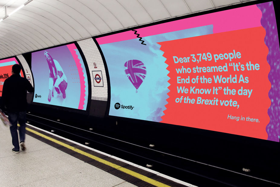
Thanks 2016, It’s been weird. Spotify, UK.
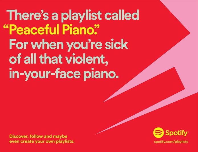
Spotify, US.
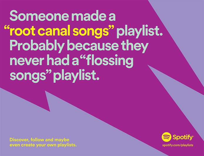
Spotify, US.
The second campaign is from a bookstore in Mexico called Ghandi. Since 2001 they’ve been running this text-based marketing campaign on Bags, Bookmarks and Billboards. They occasionally modify their template to incorporate an image or graphic, but generally present black text straight on the same bright yellow. The messages are always quirky and ask you to read, sometimes forcefully, often with puns, and occasionally by making typographic errors that suggest you should be reading. Due to the use of text it’s similar to Spotify’s two campaigns, and I’m probably drawn to them in part because of my interest in writing and text-art. Another important similarity between these campaigns is in how the references are sometimes very coded with localized knowledge. One of Spotify’s London ads specifically referenced the closing of the iconic nightclub Fabric as a result of gentrification in the area. Beyond the ones I’ve added here, I’ve seen Ghandi billboards that reference such diverse things as protests (and traffic), graffiti, socialism, traffic control regulations, and the book to movie pipeline,
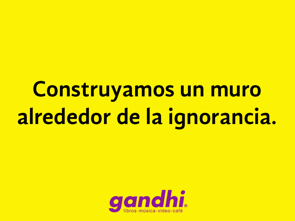
Billboard, Ghandi, 2016. Trans: “Let’s build a wall around ignorance.”
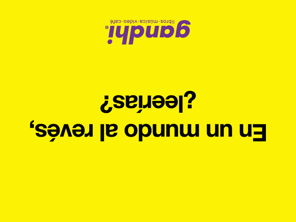
Billboard, Ghandi, 2009. Trans: “In an upside down world, would you read?”
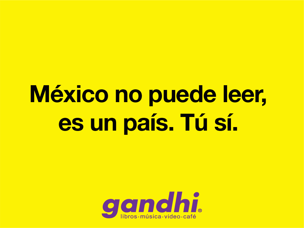
Billboard, Ghandi, 2012. Trans: “Mexico can’t read, it’s a country. You can.”

Billboard, Ghandi, 2015. Trans: “Gluten free books.”
The reason I like these campaigns is because they use qualities that are intrinsic to the brand they’re attached to. So they are in a way medium specific and content specific. The campaigns understand what sets their products apart and then do something fun with it. Spotify uses music references, the customizability of playlists, and the scores of anonymized data it collects to present messages that are both incredibly funny and also very timely. By presenting it’s findings in public it also allows us to share in that knowledge anonymously. We’re simultaneously able to find a quote ridiculous, and incredibly relatable without anyone knowing. Meanwhile, Ghandi similarly uses humour (specifically puns) in its long running campaign, but instead draws connections between manners, reading, literacy, and the imagination. In so doing, It acts very much as a public information campaign in the public interest (reading!). It thus becomes this strange physical version of your parents telling you what to do when you were a child. This is why I also like both campaigns, because they’re public campaigns that invite you to engage with them in public spaces. Both use a traditional format, but one that is shared and largely visible by everybody. Neither of these campaigns would be particularly effective in the same way as photographs or videos on social media. (though the second spotify campaign did make three videos which interviewed artists included in really weird playlists – again playing to the strengths of the video format). Online, you can like, and share, and then it disappears, subsumed under tomorrow’s content. That billboard though? It’s always going remind you that you’re not alone, and that you should pick up a book.
]]>The press release is a funny thing. They’re a ton of work (from my experience not doing an actual press release (I’m not certain at what point you qualify to be honest) but doing enough of the copy to fret over it), and in the context of an artwork or an art exhibit, getting the language right is hard.
In the fall of 2015, I took FPA 319W: Critical Writing in the Arts. In that course, we did a really great exercise that I always meant to return to. As a class, we watched a short video-work where someone was dragging a very large parcel (or body bag) up the side of a hill next to a highway. Afterwards, we were divided into groups of three and had to write a press release in 30 minutes to present to the class. The variety of descriptions and characterizations for the work were impressive, and I always mean to return to the exercise as a way to practice writing (always). The other relevant element from that day was in one of our first readings, which was on International Art English (IAE) and there’s some gems in it that I’d forgotten about:
International Art English
by Alix Rule & David Levine
On the rise—and the space—
of the art-world press release.
“The internationalized art world relies on a unique language. Its purest articulation is found in the digital press release. This language has everything to do with English, but it is emphatically not English.”
“We know it when we see it. No one would deny its distinctiveness. Yet efforts to define it inevitably produce squeamishness, as if describing the object too precisely might reveal one‘s particular, perhaps peculiar, investments in it.”
“The press release, appearing as it does mysteriously in God knows whose inboxes, is where attention is concentrated. It‘s where IAE is making its most impressive strides.”
“IAE always recommends using more rather than fewer words.”
It’s hilarious, but also very, very real. Figuring out how to speak and write about work (especially your own) is not easy. It’s also something we’re all emphatically aware about. We laugh about International Art English, we do, especially when we accidentally do it, but there is also something weirdly aspirational about it. Rule & Levine hypothesize that “people all over the world have adopted this language because the distributive capacities of the Internet now allow them to believe—or to hope—that their writing will reach an international audience.” I think in a way they’re right, you want to fit in, and suddenly you’ve moved beyond jargon and you’re in IAE. This is the issue I have with writing press releases, in figuring out how to strike the balance in the language. In describing the project, while also remaining accessible. It’s hard to tell though, as many of my peers and colleagues are also in the same environment so there’s not always a solid frame of reference for what’s ~ normal.
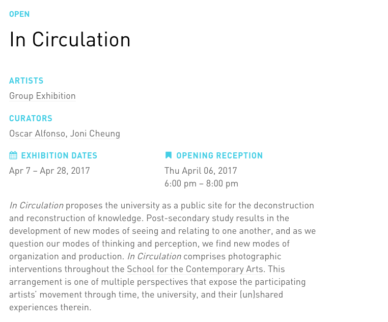
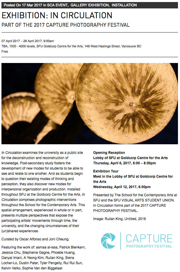
I’ve now gotten to write two press releases. The first was last spring for my grad show _____________, and a space. The second was for In Circulation. The difference this time around was that I saw the project through from the start to the end and had to deal with adapting the writing depending on the platform, expanding and contracting it in the process. I’m uncertain how much of this is part of the natural process of moving from format to format (say Capture page to poster to brochure) or the result of putting on an ambitious exhibit all at once. I think the variation between the Capture version and the SCA/FB version is unnecessary, but that’s the result of the short timeframe that the original version was written in.
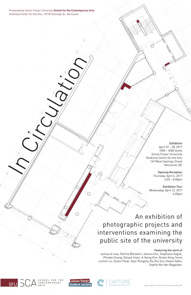
In Circulation Exhibition Poster, Oscar Afonso, 2017
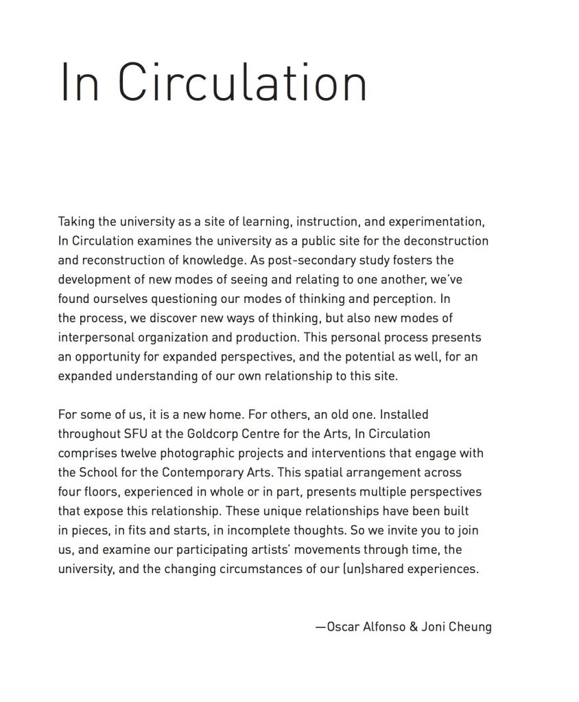
In Circulation Curatorial Statement in Brochure, Oscar Alfonso, 2017.
As I’ve already mentioned, I didn’t necessarily do a good job with some of these iterations. What the SFSS sent out on our behalf could have been better. Though I think I did a decent job distilling the sentences used for the posters, even if I’m not overly convinced with them. In the end this is something I need to practice more, and actually draw from that 319W exercise and just write different versions for work I see in galleries, films I watch in theatres etc. Practice here is of definite benefit, especially if I move further in that direction towards curation, publicity & administration, and end up having to write more press releases in my work. I think it would also be useful to expand this exercise and also write shorthand versions – and try out variants of what would go on a poster, and what a facebook post would be for instance. I’ve always wanted to make art accessible, so I’ll have to figure out how to make the writing do that too.
Erik Kung – Photography: My life through a shutter – eckung.com
Erik has set himself up as a photographer. I think his theme choice is a fairly solid one, posts are horizontal strips on the home page that combine an image on one side with the post title and category info on the other. They alternate sides as they stack, which is a nice visual detail, and this way you always get to see some of Erik’s photography.
By saying “My life through a shutter,” Erik has framed this as a personal photo portfolio/page of some kind, so it’s a little odd that his name isn’t anywhere on the homepage. I think his caption works well on it’s own and directly references photography, so I feel like the giant ‘PHOTOGRAPHY’ on the top left of his site is taking away the real estate where his name could go. Related to this, Erik has no photograph of himself anywhere, which for commercial photography feels strange for me but is not entirely necessary either.
His posts are all fairly straightforward with a single image accompanied by a few sentences of accompanying observations and thoughts. The theme I don’t think is as successful if this is his primary posting format. A lot of real estate is lost by the white and black backgrounds that could otherwise be used to further highlight a photo. In his about page, he mentions how his comments are meant to be brief, so the short texts that accompany each photo make sense. However, I’m left wanting to know more. In his video he talks about making connections between photos and memories and photographing everyday life in the process. He also mentions ‘the life of the student,’ but from what I could see his school is only barely hinted at. I wonder how much he could maybe expand on these little stories or observations, and maybe do different kinds as well. During his presentation Steve Burgess pointed out that it’s hard to get paid as a hired photographer (Erik is quoting $100), and I think that maybe he could use some of his photographic posts to go into detail about how he takes photos and his process, thus making his mode of working more visible (and also his ‘hire-ability’). Similarly, I think that service also needs to be mentioned in his ‘about’ page where he points out that he’s interested in selling photographs.
In terms of social media, he has a flickr account halfway down his ‘about’ page. I think it should probably be moved up or down so it’s separate from the body copy where he discusses his photographs and who he is, that way it’s more visible. I think Erik would also need to branch out into other social media, Instagram comes to mind, especially if he sticks with the little sentence or two of context with each photograph. Based off of the current setup, I don’t know how he’s attracting visitors to the site. Instagram would be a potential remedy to this, as I know that a lot of photographers use it to drive interest and then traffic to their actual portfolios and sites, though as a very busy platform there’s a lot of optimization and perhaps photographic focus that Erik would need to do to make it work.
I feel like the presentation of information, and the networking of the site (social media) needs touching up. However, I think there’s potential in his combination of photographs and descriptions that are very natural, and authentic. They’re sincere and the kind of thing I’d hear if I was out taking photos with a friend and not hyperbolic or stereotypical. It’s a nice change.
]]>Looking through my Google Analytics I’m impressed (and concerned) by how much information is hypothetically available. In my particular case there’s very little, due to this site’s lack of connections and it’s role as a portfolio/database vs say, a well connected blog. This is because currently, the site isn’t linked to either my Facebook or my Instagram, which means that it’s just not connected. I’ll get around to doing this at the end. While this means that making use of analytics within the context of this course won’t be great, I’m doing it because it’s a portfolio. So I’d rather have it done up and touched up before it goes ‘public,’ It’s my long term quality over speed view.
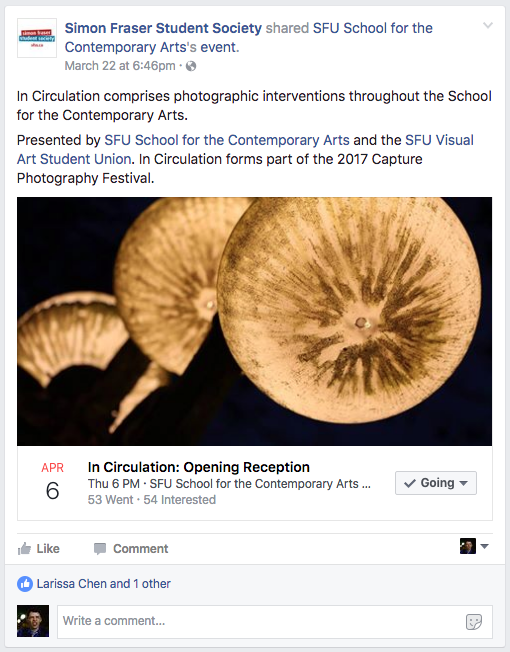
Looking at the analytics for the facebook event for the SCA exhibit In Circulation, I’m able to reflect on our publicity approach and reveal a lot of deficiencies in our publicity plan, or lack thereof.The event was made by the School for the Contemporary Arts, who set me up as the admin for the (my) event. As admin and basically also publicist for the exhibition I was able to see the spikes in traffic and views, and thus make some observations about my attempts to promote the event.
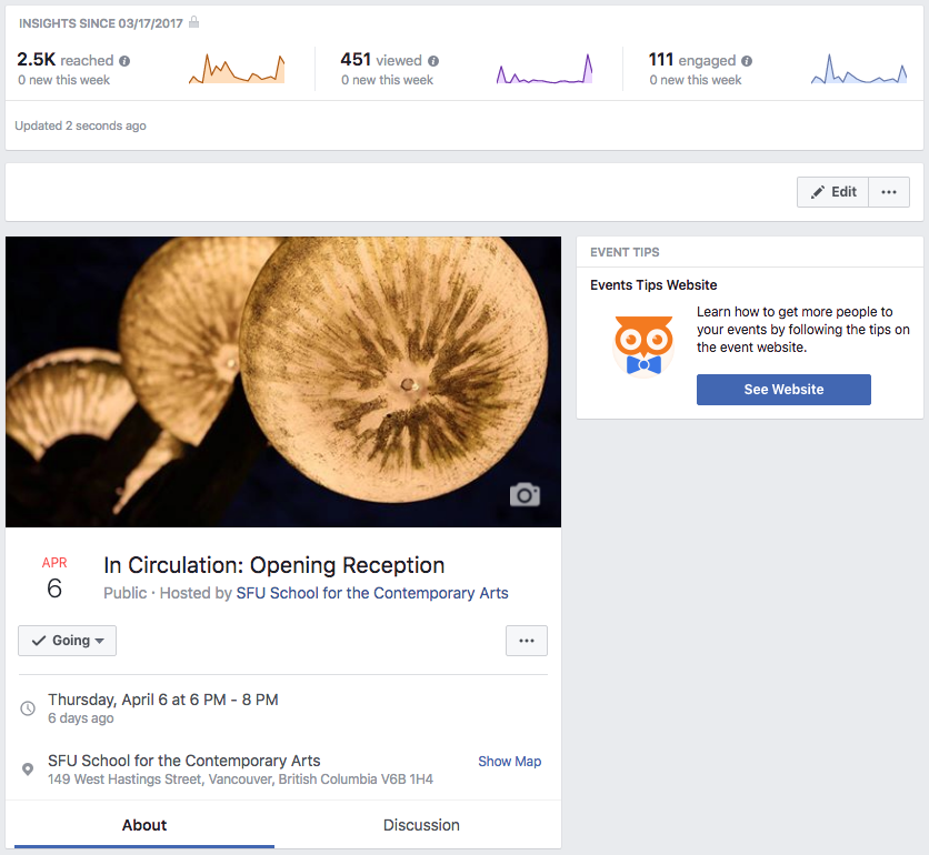
At least one participating artist started sharing the capture website page before we had a facebook event for the opening. When there’s multiple different pages (Capture, SCA, FB) it becomes necessary to coordinate which are being pushed on Facebook. We had 14 participating artists and a handful of other people helping with the exhibit. Though some shared the event, very few directly invited their friends. You’d think it would be an easy thing to do for an event you’re in, but you literally have to drag people into doing it.The first spike in reach, views, and engagement was from this initial round of invites amongst myself and a handful of the participating artists. These are pretty even, reflecting that we were spot on in our targeting at this point.
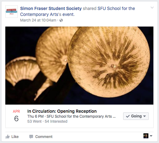
The second major spike in reach is largely the result of the SFSS sharing it on their FB page, That this translated into few actual views is noticeable. In part it’s reflective of the SFSS being a larger umbrella organization that’s not as targeted for an exhibition opening. However, it’s definitely also from a deficiency in my social media plan (made on the spot). The event was shared March 22nd and 24th, well in advance of the opening (I forgot to approach them for closer reminders nearer to April 6th). Moreover, the description here is dull and not engaging and more importantly doesn’t really communicate that this was a wholly SFU student organized, volunteer run exhibition part of a major city wide arts festival. So yeah, I missed the audience mark on that one.
The listing I sent in to instant coffee (an e-mail based weekly listing of events and arts opportunities, it’s solely text) didn’t contain a link to either the capture page or the Facebook event, It’s possible its efficacy was thus limited in terms of driving traffic to the event. While not overly common, some listings do include event links. From experience, instant coffee e-mails contain a ton of information and you have to actively be looking for things (like say openings). So name recognition – School for the Contemporary Arts – is thus important here.
There remains the unresolved question about wether the FB event should start with the exhibit, or with the opening (as this opening is ‘before’ the exhibit). A FB event with a start date after the opening (as with the 2017 BFA Grad show) means that the reminder comes the day after the opening and is thus confusing. A FB event that starts with the opening raises the question of when you close the event – when the opening is over? or when the exhibit is? This is something that also becomes difficult when the exhibition stretches beyond Facebook’s event length limits. In this case the event was for the opening, but then that meant that you can’t share the event afterwards for say, a reminder about the exhibition tour.
The drop-off in reach, views and engagement after the beginning is partially a limitation of the invites and audience network, and my limited ability to structure a coherent social media plan. Another option to explore here would have been to populate the event with content. When an event has a two or three week lead-in, you would benefit from constant reminders about it happening. However, this means that you need to have an integrated channel between content production (the artwork and curatorial component of the event) and publicity. There needs to be material for you to post after all. Moreover, what would this material be? Is this of the projects in the show (and what if they’re still being made!), or is it production shots as things are being made? Or is it perhaps installation shots (which require installation to happen several days advance).
The Facebook event for In Circulation was a great opportunity to consider how to actually go about sharing and driving traffic towards an event, particularly since it’s within my work interests, and also since a breakdown of my efforts reveals all the questions that remain and all of my mistakes. In the end I now know that it can’t be an afterthought, I need to have a comprehensive social media and publicity plan that’s well communicated (to the artists for instance) and that it has to be integrated with the exhibition planning and production itself, particularly if you’re going to be promoting the event using actual content.
]]>I’ve referred to this site and to my professional presence as an extension of my practice. As something that should be consistent with the overall vision and message, It is thus something that has to be ‘on brand.’ But what does it really mean to consider myself as a brand?
Within the publishing environment, this consideration always returns to that Simon Sinek talk “How great leaders inspire action.” In it, Sinek discusses different technology companies and the value proposition that they use to drive consumer purchases. Purchases that Sinek describes as the result of those companies’ successful ability to communicate an authentic narrative or story, the “Why you do it.”
This consideration in and of itself is easy enough, I enjoy exploring how people tell stories, and my personal art practice focuses on how we can, or are limited in telling stories through text, sculptural or photographic means. Within my work practice, this focus on telling stories is in supporting initiatives that allow people to connect (say elections, or orientation programs) alongside initiatives that allow other people to share their stories (as curator and arts administrator).
Within the arts more broadly, the concept of the brand is also quite common in various distinct forms. Many museums now consider themselves as brands, controlling the kind of exhibits they plan, producing merchandize and commodifying a public image through goods and social media. Similarly, many museums are treated as brands by artists, who see them as institutions and markers to be added to a CV, signifiers of success and belonging within particular art environments.
On the other hand, one can consider artists as a brand. Something which has become an increasingly pertinent question as art markets and festivals become increasingly commercialized. Many artists are now inseparable from their brands. This can take the form of their name, imagery, or identity as is the case of Frida Kahlo and Pablo Picasso – two individuals whose names and likenesses have been used and adapted to sell just about anything from cars to waterbottles. On the other hand, there’s the visual brand of an artistic practice. Artists such as Barbara Kruger, Cindy Sherman, Jeff Koons, Anish Kapoor, Jeff Wall, or Catherine Opie are immediately recognizable in their work, and thus build upon a readily identifiable critical or visual aesthetic.
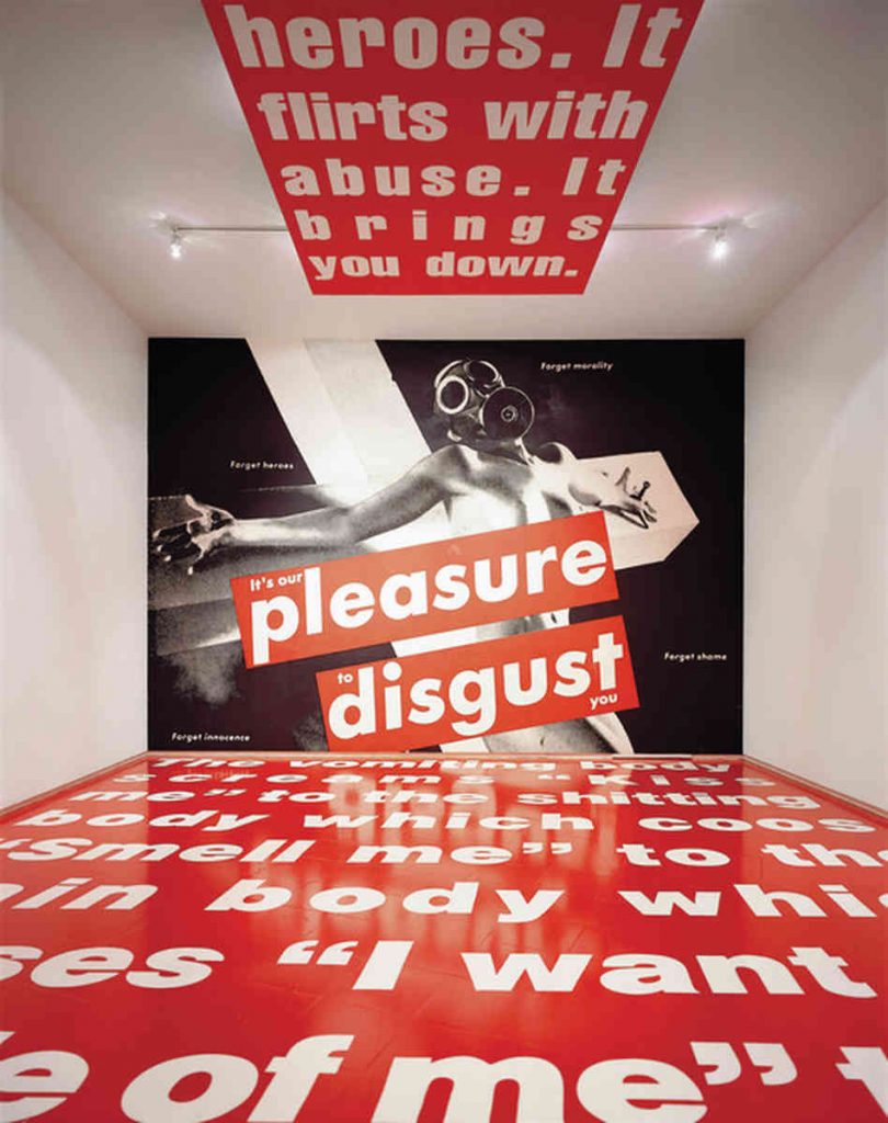
Untitled (It’s our pleasure to disgust you), Installation Shot at the Mary Boone Gallery (1991), Barbara Kruger, 1982
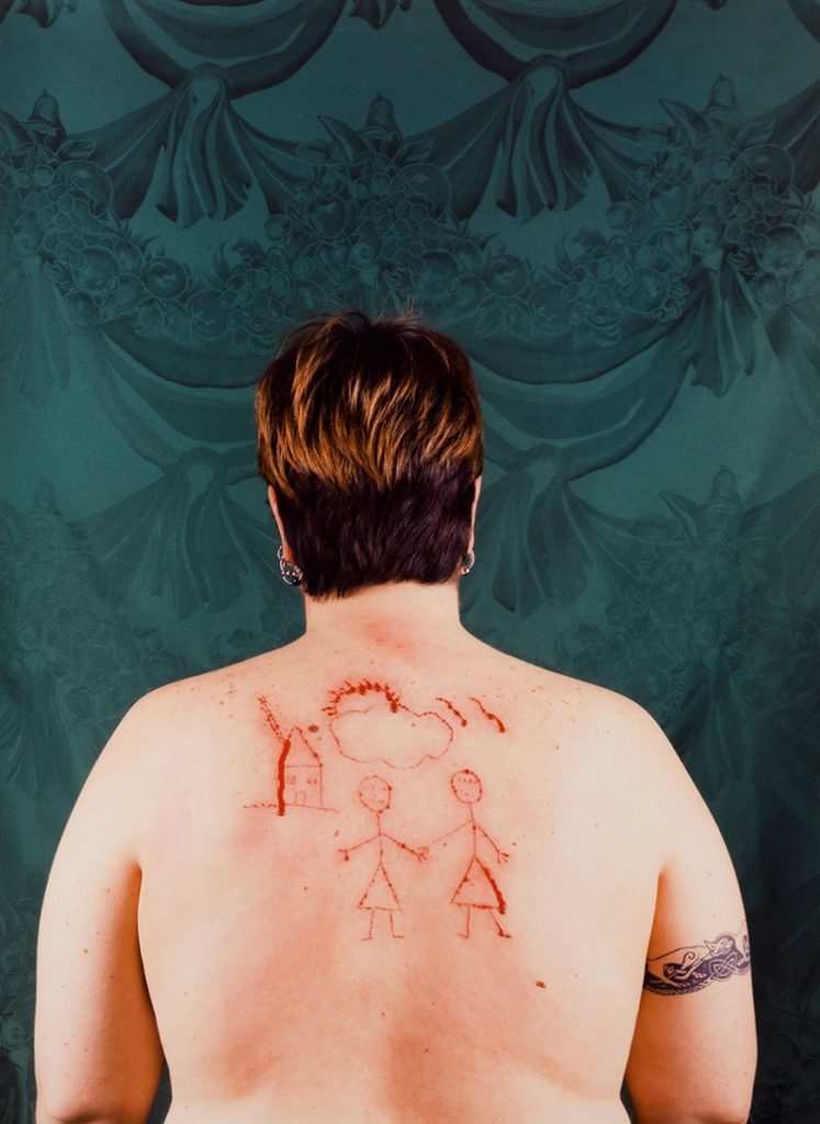
Self Portrait/Cutting, Catherine Opie, 1993
So the important question becomes how does a diverse practice like mine reconcile itself as a brand – particularly when there’s no unique aesthetic form that carries from work to work? Moreover, how is this ‘brand’ affected by my work experience, curatorial work, or if I go and get a job doing something else entirely (say working as a flight attendant as I almost did twice)?. This consideration is important not only as I try to reconcile these different issues onto a single digital platform, but also in how I frame it. The url of this site presents one such opportunity and point of tension here. There was after all considerable discussion around the benefits of using oscaralfonso.com vs os.alfonso.co, a url that amongst other things was predicated on .co as a branded business entity and positioned my art practice as a producer over solely an artist.
I’m also reminded of my friend and colleague Lauren Tsuyuki, who would always know a project was mine, even If I switched drastically between mediums. According to her, they were always thoroughly researched, very controlled, organized, and restrained into shape. Perhaps this is where some of my own internal consistency – and brand – kicks in. My projects are often simultaneously playful and dramatic, personal and ambiguous, controlled and also quite fun. So perhaps another important component of my brand then is perhaps in how I work. After all, earlier iterations of my artists’ statement focused on how I prefer working by hand, and though I have slowly moved more into a digital space through publication design, the fact remains that I prefer doing the work myself.
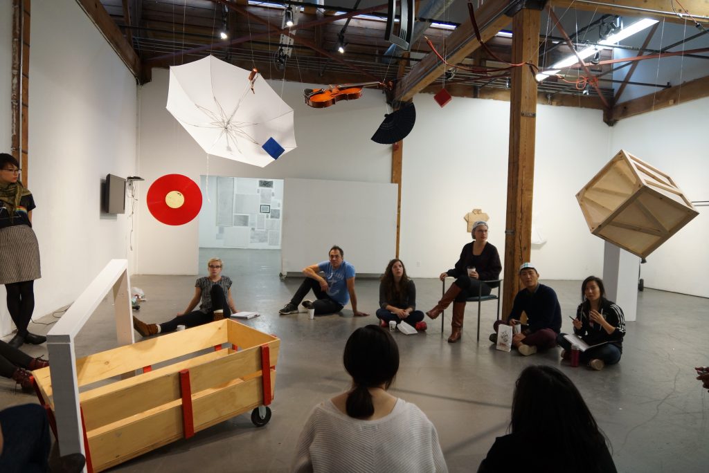
Object Theatre I, Installation Shot, Oscar Alfonso, 2014.
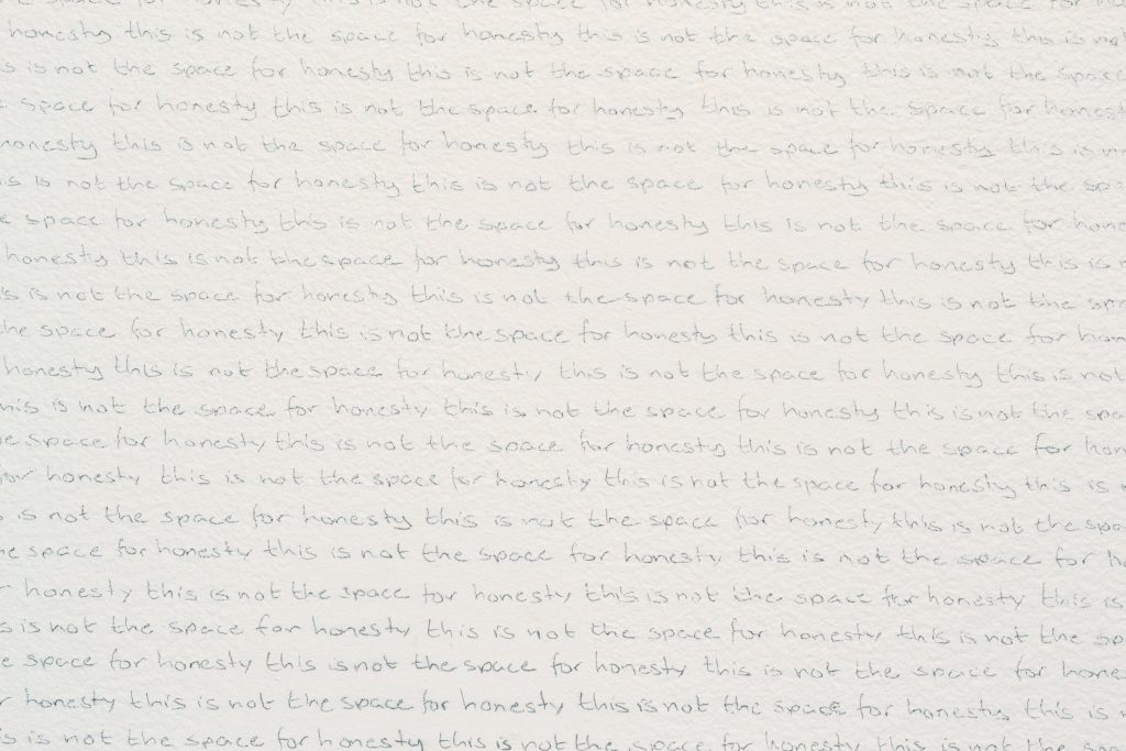
This is not the space for honesty, Detail, Oscar Alfonso, 2016.
When it comes to new areas of expertise that are necessary for a project, I prefer learning about a new skill and delving into a new field. This mode of working through a hands on approach is thus an important part of how I work, and of how I might position myself as a ‘brand.’ Some artists, such as Ian Wallace and Ken Lum, work in small studios and hire out for portions of the work (in their case with type and signage). Others, like Simon Fujiwara have a small staff of artists’ assistants that support them on projects, and then there’s others like Jeff Koons and Ai WeiWei who hire hundreds of people to commission work produced by the labour of others. Thus, I propose that my own personal interest in learning, and in hands on work for my projects, is an important part of how I work and of my brand proposition as an artist. This is much the same in my personal work experience in administration and event management where I always attempt to connect personally with the people I’m serving or working with, even if I’m ostensibly in charge of a project and ‘have better things to do,’ (which I don’t since people come first).
Which brings me back to my common reference to ‘internal consistency,’ I’ve frequently referred to my interests in a critically engaged artistic practice, and I think this is also an important consideration in the development of a ‘brand.’ Thus I should ascribe to work on projects and commissions which somehow add to the site or conversation, rather than simply act as artistic decoration. I’m reminded here of Simon Fujiwara, who spoke to our field-school class and mentioned a specific project in a closed Welsh Prison, where he was invited to work with other artists inside individual jail cells as part of some kind of corporate art-brand festival exercise (something he turned down) in the process of this undertaking he would have been neglecting the unique history of the site and of the people that passed through those cells. The Vancouver Mural festival presents another similarly complex opportunity. While from certain perspectives it may be an excellent community event and an opportunity for increased visibility, it nevertheless betrays the critically engaged artistic medium of muralism (specifically from 1920s Mexican muralism) which is socialist, politically informed, and engaged with the site and community.
Thus them, I propose that I will aim to provide an internally consistent practice and service, focused on telling stories and facilitating the telling of stories by others. A practice that is critically engaged and conscious of the specifics of the project and site, and in which I am involved in ideation, planning, and execution from the start to the end. My brand is thus a diverse one that is focused more on ideas and processes than aesthetics, and it is one that is playful and serious, personal, and ambiguous.
]]>There’s an unresolved visual conflict here between a visual simplicity that doesn’t quite hit minimalism, and my unsatisfied desire to draw from the Mexican Modernist Architecture of Luis Barragán. Unfortunately, the kind of emotive colour palette to which I’m instinctively drawn to, isn’t something that I think I’ll be able to translate to this site in any form that remotely resembles satisfactory. Strong simple colours tend to look flat and garish online, abandoned as they are by the texture provided by physical mediums. In terms of visual simplicity I’m also conscious off how to make this platform active, accessible and visually pleasing. I don’t want a dry kind of design-based-hip-minimalism or a high-brow-fine-art-photography aesthetic.
So I’m left with a kind of ambivalent visual simplicity that could definitely be tightened up as individual pages develop.The Minerva Modern typeface I’m currently using is quite striking, but definitely has many issues on this site. On the homepage, the square submenu icons are off and the body copy is too small a font size. Visually however, I’m happy with the front page. It subsumes everything to the image, which is perhaps counterintuitive as my name isn’t the first thing to register. As my intent is to focus on my professional self through my work, I’m quite happy with the subtlety that I’ve settled on.
Despite my interest in writing and varied work experience back-of-house, I think this site needs to read first and foremost as an artists’ portfolio. This focus is what drove my original search for a theme, and has driven the desire to visually simplify and hierarchize content (by say, removing the blog element). Transplanting projects onto this platform and figuring out page layout will be difficult. My skill with WordPress is somewhat limited to providing simple, clean, and regimented content. Translating certain approaches – like the use of markups and annotation will be an interesting proposition as this is something which I find easier to do physically. As I don’t think that the imposition of a physical approach to a digital space would be convincing, I’d have to find someway of annotating and organizing information that seems natural to the digital realm.
Gabrielle Hamilton’s Cookbook Prune is an excellent example of this conflict. Produced to reference the in-house recipe binders used at Prune, the recipes in the book are annotated with taped-in ingredient multipliers and snarky observations by the Hamilton. While this makes for a hilariously entertaining and uniquely beautiful read, I remain unconvinced by the use of scans from a particular kind of book into a hardcover. It feels as though the facade of a cover has been extended to the interior, without conceptually resolving the message. A full commitment to the idea might have been to produce a binder instead of a hardcover, or to find another way of subverting the concept of a cookbook. In a similar way I remain uncertain about how to organize content on this site, and on how I might approach the addition and annotation of content.
There’s a few other important visual elements to consider. With a diverse practice based in writing, curating, administration, and contemporary arts, It doesn’t make sense for me to develop a logo. Later on I’ll delve in more detail into the conceptualization of the self and the idea of a brand. In short form however, the use of a logo speaks to a shift towards design and a service oriented practice. Though I may have an interest in certain kinds of design – specifically in publication – I’m not a designer. As such, the use and development of a logo for myself or for my digital platform seems unnecessary.
The social media profile photograph is another point of contention. On principle I have a problem with photos that include me in them. Rooted in some kind of visual anxiety, I’m never satisfied with how I’m represented in photographs. For the time being I think I’ll retain my ridiculous Facebook and Instagram photo, as I think it is immediately recognizable and also communicates a lot of character. It’s worth considering how that particular photograph may be replaced with another one in a similar vein, however that kind of photograph doesn’t come along every day. Another possibility is to draw from existing and future mirror self-portraits and take another tack at my photographic-self-anxieties. These would likewise be identifiable for the centred focus of myself as the subject, and the simultaneous subversion of my identity within the profile photo format.
I n my Typography workshop this semester I went through the process of developing a monogram of Oscar Alfonso. This OA monogram, which uses Orpheus Pro regular, is worth considering in relation to this project. Though It’s a solid project I’m convinced on how it represents my professional self. Though it has the solidly considered formal simplicity that I’m interested in, it also feels a little flat and overly fancy. As my professional self isn’t centred around the provision of design or photographic services, I don’t particularly have a pressing need for personal business cards. This may change in the future, but what it does mean right now, is that the consideration and finalization of a monogram can wait for a future date. Once that need arises I can revisit the necessary design of an OA monogram that feels a little more eclectic, personal, and perhaps colourful.
