In progress and under consideration – Journal 3 – Can you see it?
In Progress and Under Consideration is a reflective series prepared for Publishing 201 – the Publication of the Professional Self. This series is in part a fulfillment of a pre-discussed and agreed upon exchange of academic services and goods, and also a personal reflection on where I’m going and whatever it is I’m doing here.
There’s an unresolved visual conflict here between a visual simplicity that doesn’t quite hit minimalism, and my unsatisfied desire to draw from the Mexican Modernist Architecture of Luis Barragán. Unfortunately, the kind of emotive colour palette to which I’m instinctively drawn to, isn’t something that I think I’ll be able to translate to this site in any form that remotely resembles satisfactory. Strong simple colours tend to look flat and garish online, abandoned as they are by the texture provided by physical mediums. In terms of visual simplicity I’m also conscious off how to make this platform active, accessible and visually pleasing. I don’t want a dry kind of design-based-hip-minimalism or a high-brow-fine-art-photography aesthetic.
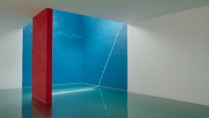
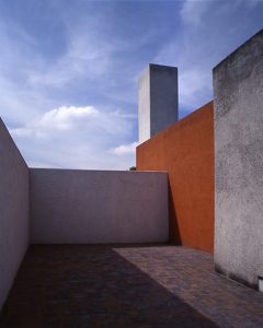
So I’m left with a kind of ambivalent visual simplicity that could definitely be tightened up as individual pages develop.The Minerva Modern typeface I’m currently using is quite striking, but definitely has many issues on this site. On the homepage, the square submenu icons are off and the body copy is too small a font size. Visually however, I’m happy with the front page. It subsumes everything to the image, which is perhaps counterintuitive as my name isn’t the first thing to register. As my intent is to focus on my professional self through my work, I’m quite happy with the subtlety that I’ve settled on.
Despite my interest in writing and varied work experience back-of-house, I think this site needs to read first and foremost as an artists’ portfolio. This focus is what drove my original search for a theme, and has driven the desire to visually simplify and hierarchize content (by say, removing the blog element). Transplanting projects onto this platform and figuring out page layout will be difficult. My skill with WordPress is somewhat limited to providing simple, clean, and regimented content. Translating certain approaches – like the use of markups and annotation will be an interesting proposition as this is something which I find easier to do physically. As I don’t think that the imposition of a physical approach to a digital space would be convincing, I’d have to find someway of annotating and organizing information that seems natural to the digital realm.
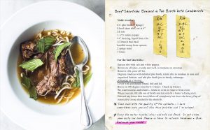
Gabrielle Hamilton’s Cookbook Prune is an excellent example of this conflict. Produced to reference the in-house recipe binders used at Prune, the recipes in the book are annotated with taped-in ingredient multipliers and snarky observations by the Hamilton. While this makes for a hilariously entertaining and uniquely beautiful read, I remain unconvinced by the use of scans from a particular kind of book into a hardcover. It feels as though the facade of a cover has been extended to the interior, without conceptually resolving the message. A full commitment to the idea might have been to produce a binder instead of a hardcover, or to find another way of subverting the concept of a cookbook. In a similar way I remain uncertain about how to organize content on this site, and on how I might approach the addition and annotation of content.
There’s a few other important visual elements to consider. With a diverse practice based in writing, curating, administration, and contemporary arts, It doesn’t make sense for me to develop a logo. Later on I’ll delve in more detail into the conceptualization of the self and the idea of a brand. In short form however, the use of a logo speaks to a shift towards design and a service oriented practice. Though I may have an interest in certain kinds of design – specifically in publication – I’m not a designer. As such, the use and development of a logo for myself or for my digital platform seems unnecessary.
The social media profile photograph is another point of contention. On principle I have a problem with photos that include me in them. Rooted in some kind of visual anxiety, I’m never satisfied with how I’m represented in photographs. For the time being I think I’ll retain my ridiculous Facebook and Instagram photo, as I think it is immediately recognizable and also communicates a lot of character. It’s worth considering how that particular photograph may be replaced with another one in a similar vein, however that kind of photograph doesn’t come along every day. Another possibility is to draw from existing and future mirror self-portraits and take another tack at my photographic-self-anxieties. These would likewise be identifiable for the centred focus of myself as the subject, and the simultaneous subversion of my identity within the profile photo format.
I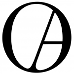 n my Typography workshop this semester I went through the process of developing a monogram of Oscar Alfonso. This OA monogram, which uses Orpheus Pro regular, is worth considering in relation to this project. Though It’s a solid project I’m convinced on how it represents my professional self. Though it has the solidly considered formal simplicity that I’m interested in, it also feels a little flat and overly fancy. As my professional self isn’t centred around the provision of design or photographic services, I don’t particularly have a pressing need for personal business cards. This may change in the future, but what it does mean right now, is that the consideration and finalization of a monogram can wait for a future date. Once that need arises I can revisit the necessary design of an OA monogram that feels a little more eclectic, personal, and perhaps colourful.